 Sign-up for free online course on ANSYS simulations!
...
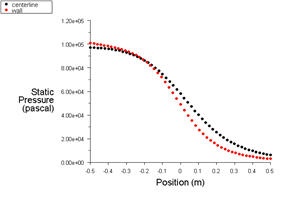
Notice that the pressure on the fluid gets smaller as it flows to the right, as is consistent with fluid going through a nozzle.
Pressure Plot
Let's look at the pressure along the centerline and the wall.
Plot > XY Plot
Make sure that under Y-Axis Function, you see Pressure... and Static Pressure. Under Surfaces, select centerline and wall. Click Plot.
It is good to write the data into a file to have greater flexibility on how to present the result in the report. At the same XY Plot windows, select Write to File. Then click Write... Name the file "p.xy" in the directory that you prefer.
Open "p.xy" file with notepad or other word processing software. At the top, we see:
| Code Block |
|---|
(title "Static Pressure")
(labels "Position" "Static Pressure")
|
First line tells us the properties we are comparing. For our case, we are looking at Static Pressure.
Second line tells us about the x and y label.
There is a header at the beginning of each the data sets so that we can differentiate which data sets we are looking at. For our case, we have "centerline" and "wall" data sets.
Following is an example of two data sets (centerline and wall).
| Code Block |
|---|
((xy/key/label "centerline")
-0.5    97015.3
-0.48    96949.9
...
0.5    6012.92
)
 ((xy/key/label "wall")
-0.5    100853
-0.480911    100496...0.5    2874.7
)
|
Try copy the appropriate data sets to excel plot the results.
Temperature Contour Plot
Now we will plot the temperature contours and see how the temperature varies throughout the nozzle.
...