 Sign-up for free online course on ANSYS simulations!
...
This brings up a plot of the axial velocity as a function of the distance along the centerline of the pipe.
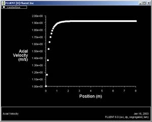
In the graph that comes up, we can see that the velocity reaches a constant value beyond a certain distance from the inlet. This is the fully-developed flow region.
...
Now we can plot the velocity profiles at x=0.6m (x/D=3) and x=0.12m (x/D=6) along with the outlet profile. In the Solution XY plot menu, use the same settings as above. Under Surfaces, in addition to outlet, select line1 and line2. Make sure Node Values is selected under Options. Click Plot. Your symbols might be different from the ones below. You can change the symbols and line styles under the Curves... button. Click on Help in the Curves menu if you have problems figuring out how to change these settings.
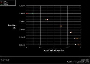
The profile three diameters downstream is fairly close to the fully-developed profile at the outlet. If you redo this plot using the fine grid results in the next step, you'll see that this is not actually the case. The coarse grid used here doesn't capture the boundary layer development properly and underpredicts the development length.
| Panel |
|---|
In FLUENT, you can choose to display the computed cell-center values or values that have been interpolated to the nodes. By default, the Node Values option is turned on, and the interpolated values are displayed. Node-averaged data curves may be somewhat smoother than curves for cell values. |
Velocity Vectors
One can plot vectors in the entire domain, or on selected surfaces. Let us plot the velocity vectors for the entire domain to see how the flow develops downstream of the inlet.
...